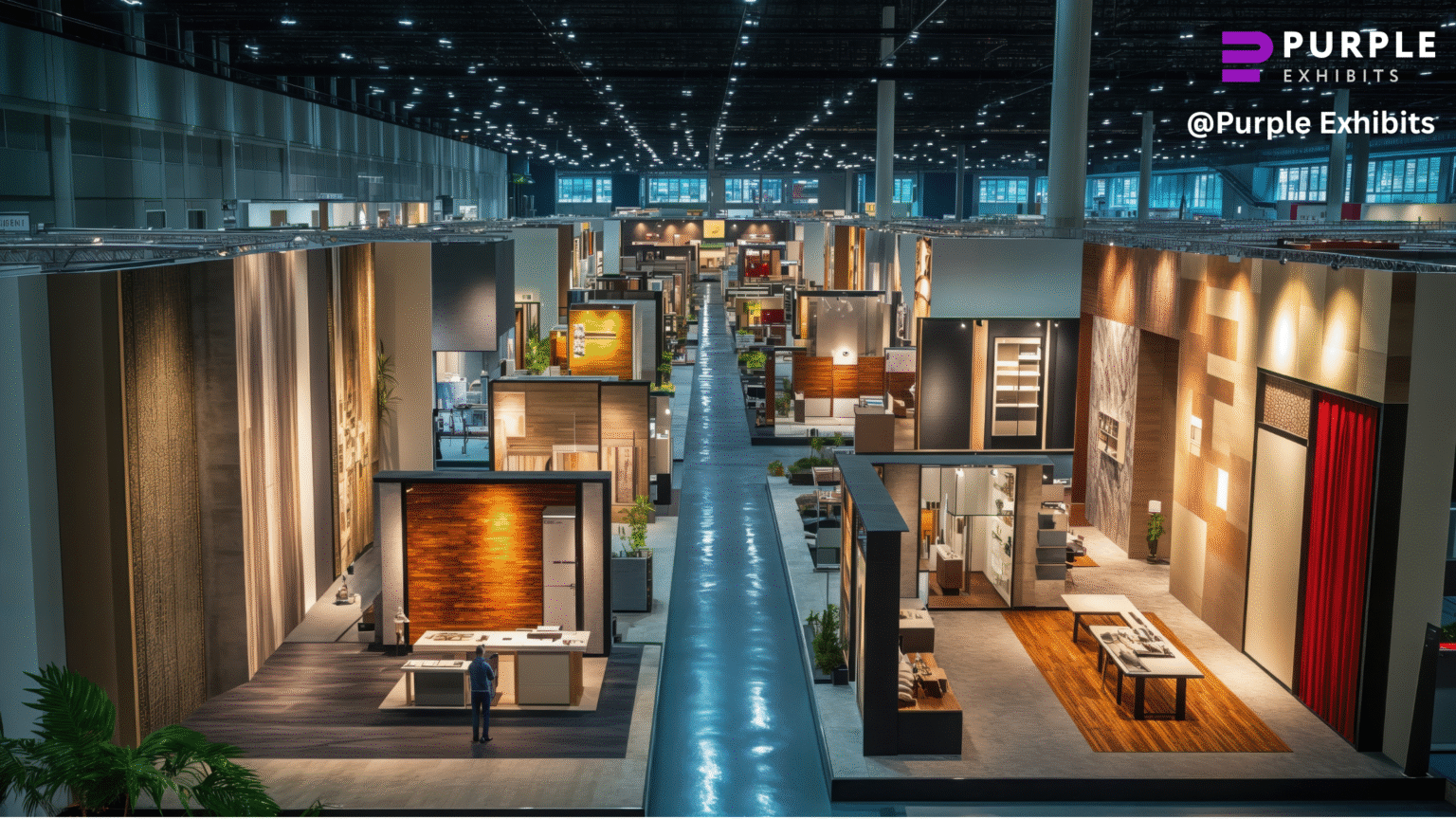
Visitors step into the convention hall and assume booths simply “appear.” Behind the glossy graphics and seamless demos is a tight choreography crews moving like stagehands, forklifts gliding in at odd hours, last-minute electricians rewiring to a schedule no one advertises.
On the Vegas strip that choreography becomes a competition: every exhibitor trying to outshine the neighbor while keeping the real playbook quiet. These aren’t the usual, safe checklist items; this is the insider thinking that turns a pretty display into a high-performing showpiece.
The Vegas-Floor Illusion Trick
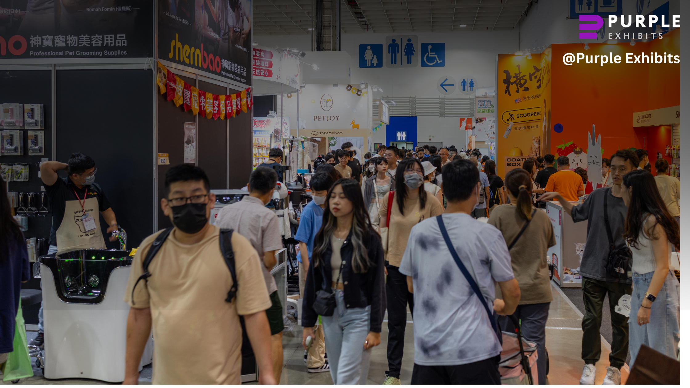
Attendees move fast through crowded aisles, so a booth has roughly three seconds to register and make a promise worth exploring. The trick veterans use is bold color contrast, a clear focal point, and lighting that guides the eye to exactly one message.
Too much copy or washed-out color blends into the background; wide, detailed visuals that read well up close fail at distance. Small changes like raising contrast, shortening headlines, and angling a light can lift recognition by a large margin. Studies show attendees scan booths in about three to five seconds, so design must win immediately.
The ‘Two-Sided Story’ Layout Hack That Makes People Stop Without Even Realizing Why
Crowds in Vegas do not approach a booth like shoppers in a mall. They cross paths, turn corners, and scan quickly, so single-side messaging loses attention before a conversation starts. About 70 percent of booths fall into this trap, according to common exhibitor estimates, because they assume a single frontal view.
The two-sided story layout solves that by creating a visual path that pulls people in from multiple angles. Use a bold headline visible from the outer aisle, a secondary message at the entry point, and an angled panel to suggest forward motion.
Small design choices like staggered sightlines and asymmetric panels on Las Vegas Trade Show Booths convert fleeting glances into purposeful steps toward the demo area
Why Lighting in Vegas Isn’t Decoration
Lighting in Vegas is not decoration, it is deliberate mood-setting. Cooler temperatures around 5000K signal tech and clarity, warm ranges near 3000K sell luxury and comfort, and neutral whites around 3500K register as trustworthy and balanced. Layered lighting is the practical secret: ambient wash to welcome visitors, accent spots to create premium focal points, and task lights where demos happen.
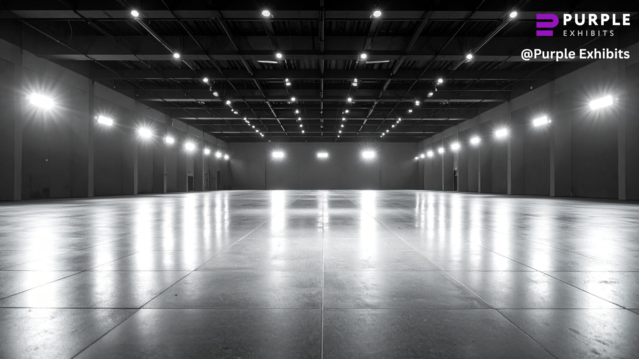
A few well-placed spotlights can create a high-end look on a modest budget, while backlit panels boost distant readability. Relying on venue overheads is a common mistake because expo lights are flat and low in CRI, which washes out brand colors and skin tones.
The ‘Silent Salesperson’ Graphic Placement Strategy Everyone Pretends Isn’t a Big Deal
- Think of graphics as a silent salesperson that works while staff talk to leads.
- Put the primary message at shoulder-to-eye level, roughly where people naturally read while walking.
- Place benefits on the natural reading line so a passerby sees value in one glance, not after scanning the whole wall.
- Use clear visual hierarchy: big, bold headline; medium subline; minimal body text. Bigger type and more line spacing speed recognition.
- Keep headlines short and scan-friendly. A single crisp promise beats a paragraph every time.
- Space elements so the eye moves from headline to product zone without stopping on clutter.
- When graphics do the heavy lifting, bounce drops and staff can focus on qualified conversations instead of shouting for attention.
For brands headed to Vegas, partnering with a local team who understands this behind-the-scenes science like Purple Exhibits often means the difference between blending in and owning the aisle. Their Vegas-trained designers and I&D experts build booths that feel effortless because all the complexity is handled long before show day.
The “Las Vegas Distance Effect”
Vegas halls are enormous, so long-distance visibility matters more than in most cities. The Las Vegas Convention Center alone offers about 2.5 to 2.9 million square feet of exhibit space, which means booths must be read from far away, not just at arm’s length.
Seasoned builders start with a tall anchor visual that reads from three aisles out, then run a quick long-view test at scale before finalizing the layout. Prototype tests include printed mockups or digital renderings checked from 30 to 50 feet to confirm legibility and color contrast. Use hanging signs when the booth sits mid-aisle; use towering structures when located against wide sightlines.
Creating a Space People Don’t Want to Leave (Without Making It Look Empty)
- Veteran crews build tiny comfort pockets that invite people to stay without making the booth look empty.
- Start with a gently curved approach rather than a straight-on tunnel; curved lines register as safer and more inviting, so visitors slow down and look in.
- Keep furniture human scale, avoid oversized couches that create dead zones or open plans that feel like outdoor plazas with nowhere to settle.
- Place seating near demo zones and hidden storage so staff can work without blocking sightlines.
- Longer dwell time reliably raises the chance of meaningful conversations, and layout is a top driver of that pause.
Skill Nobody Talks About
Seen from the show floor, install and dismantle are more choreography than construction. Crews arrive on a tight clock and the teams that win stagger tasks so crates, riggers, electricians, and graphics crews never bottleneck each other.
The real secret is a show-day operations plan that maps who does what, when, and where, down to cable routing and trash removal.
Many newcomers assume the design team will handle logistics, then get surprised when a late electrical call stalls the whole install.
This is where having Vegas-native builders matters. Teams who know the drill like Purple Exhibits handle the coordination, anticipate floor delays, and prevent the last-minute chaos most exhibitors face. With a clear ops plan, downtime drops and the booth opens on schedule, every time.
The Real Reason Some Vegas Booths Seem ‘Bigger’ Than They Are
Some Vegas booths look larger than their actual footprint because veterans build depth, not bulk.
- Layered backdrops create a visual “stack” that pulls the eye inward, and lighting placed at different distances adds separation that feels like extra square footage.
- Angled partitions guide sightlines so visitors see more of the booth at once, which tricks the mind into reading it as wider and more open.
- A few builders even use subtle mirrored accents to extend the visual field without making the space feel gimmicky.
- The quiet secret is negative space; leaving controlled gaps around key elements signals confidence and premium quality.
The Strategic Giveaway Placement Trick That Boosts Lead Quality, Not Just Foot Traffic
Giveaways in Vegas work best when they’re treated as conversation enhancers instead of bait. Experienced exhibitors place them after an interaction point so the free item feels like a reward for engaging, not a drive-by grab.
Small, irresistible items go in natural pause zones near demos or product highlights because people already slow down there, which increases scan rates and opens room for real conversations. When giveaways sit at the front, the booth turns into a freebie lane that draws crowds with no buying intent.