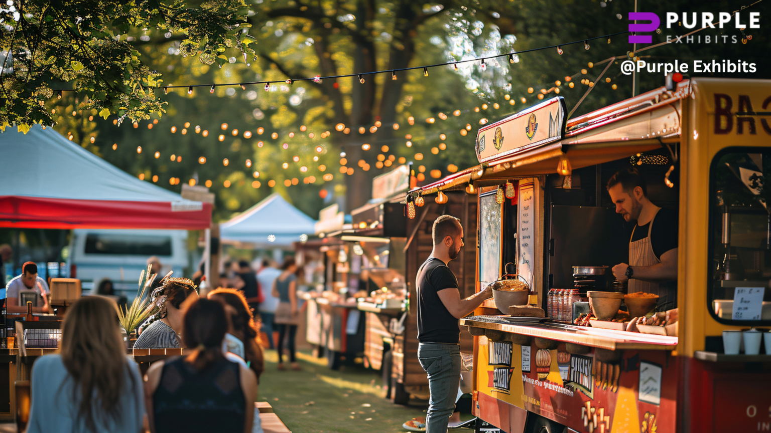
The booths that stick in memory rarely came with the biggest budgets. People drift past glossy displays, heads down on phones, scanning for something that feels worth a pause. Pretty backdrops get scrolled by; booths that earn attention do so with design choices that respect short attention spans and a noisy floor.
This opening scene isn’t about style trends on Pinterest, it’s about tactical decisions that perform under pressure: clear sightlines, a non-intimidating entry, and an instantly readable value proposition.
Before ideas come decisions most vendors ignore
A booth built to capture leads needs quick-entry kiosks, concise offers, and a simple funnel; one aimed at brand authority benefits from bold visuals, hospitality, and lingering spaces that let the brand breathe.
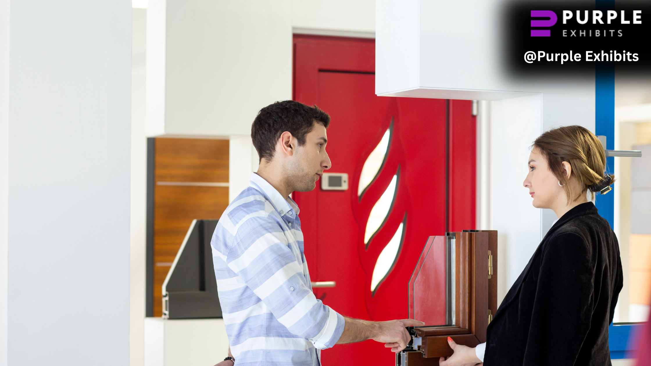
Product demo setups demand sightlines, demo stages, and staff trained for short, repeatable presentations, while partnership-focused booths require semi-private meeting nooks and workspace for follow-up materials.
When the idea and objective don’t match, for example, a demo-heavy layout squeezed into a networking-focused brief, the result is a beautiful booth that fails to move the needle.
Purple Exhibits, the best Orlando Exhibit Builders can help clarify objectives and convert them into practical design choices, ensuring every square foot supports the intended outcome.
Booth layouts that quietly pull people in without shouting
Open-corner layouts remove entry anxiety by creating a visible, low-commitment path; attendees can drift in without feeling boxed into a sales moment.
Angled walls break up monotonous sightlines and guide movement naturally, while flat backdrops often read as a closed barrier from the aisle.
Carve semi-enclosed discussion zones with low partitions, translucent panels, or raised floor-level rugs so conversations feel private but not shut off.
Aisle-facing engagement zones, demo counters, charging nooks, drop-in demo stools tend to outperform center-stage theatrics because they allow quick, accidental stops without forcing a full attention commitment.
Interactive booth ideas that don’t feel like gimmicks
- Create touch-and-try product zones with a guided flow: short instruction cards, staff prompts, and clear next steps.
- Use compact demo loops (90 seconds or less) staged so passersby can drop in and leave without missing anything.
- Install smart screens with attendee-controlled navigation.
- Design demo spots with clear sightlines so others can watch without crowding the staff.
- Put a visible timer or cue so demos stay snack-sized and repeatable.
- Place staff slightly back from demo stations so attendees feel in control, not coached.
- Avoid spin wheels, clunky AR that needs long setup, and demos that block traffic lanes.
Work with custom booth builders who map interaction zones to real attendee behavior, not assumptions. Purple Exhibits can help.
Vendor booth lighting ideas that change how long people stay
Lighting quietly controls how long people stay, even when they don’t realize it. Warm lighting tends to slow visitors down, making conversation areas and demo zones feel comfortable rather than transactional.
Cooler lighting works better for product showcases, where clarity and focus matter more than mood. Smart booths mix both, using accent lighting to guide attention toward key messages, featured products, or interaction points instead of flooding the space evenly.
Backlit graphics usually outperform front-lit banners because they read cleaner from a distance and hold visual weight in crowded halls. When lighting is treated as an afterthought, even high-end booths can feel flat, dull, or easy to ignore.
Graphics that stop traffic in under three seconds
Avoid brand slogans that explain nothing, phrases like innovation for tomorrow are stylish filler, not direction. Use negative space to guide the eye; uncluttered panels elevate the headline and make calls to action readable without shouting.
Build a visual hierarchy that places the main message in the top third, with supporting details nearer interaction points. In practice, attendees make split-second judgments based on contrast, a readable headline, and a clear offer, so dense graphics fail even when the booth looks premium.
Storage, seating, and staff comfort ideas vendors regret skipping
Hidden storage under counters, recessed cabinets, and rolling crates keep giveaways, literature, and packaging out of sight so the presentation stays clean. Staff seating should be ergonomic and positioned so team members can rest without disappearing from the floor, low stools behind counters or bench seating just inside the footprint work well.
Add discreet charging stations and cable management so devices stay ready without creating clutter. Tired teams lose energy, patience, and the quick conversational spark that turns interest into a lead; uncomfortable staff rarely hit their conversion goals.
Sustainable booth ideas that still look premium in 2025
- Use reusable modular systems that reconfigure across multiple shows, reducing waste while maintaining a consistent brand presence.
- Choose fabric graphics with tension frames for a clean, high-end look that packs lighter and ships more efficiently.
- Opt for lightweight aluminum structures paired with premium finishes to balance durability with sustainability.
- Incorporate low-waste materials like recycled panels, reusable flooring, and modular counters that don’t look temporary.
- Design components for easy graphic swaps instead of full rebuilds, extending the booth’s lifecycle.
Booth ideas that scale across multiple shows
Modular components allow layouts to reconfigure easily, so the same booth works for a 10×10, 10×20, or larger footprint without losing impact.
Swapping graphics instead of rebuilding structures keeps branding fresh while controlling costs and turnaround time. Strong design systems make this possible by maintaining consistent visual hierarchy, messaging, and flow across different booth sizes and venues.
Over a year of shows, these decisions add up to significant savings in shipping, storage, labor, and rebuild expenses. For ROI-focused teams, scalability means fewer compromises and better performance at every event.
Professional exhibit companies plan for long-term booth lifecycles, ensuring each design choice supports reuse, flexibility, and sustained results rather than short-lived, one-off builds.
How to choose booth ideas that actually fit your brand
Start by matching booth personality to brand maturity. Established brands benefit from refined, confident layouts that reinforce authority, while younger brands should favour approachable designs that invite conversation and discovery.
Skip trend-chasing that prioritizes novelty over clarity, since gimmicks often distract from the core message. Prioritize attendee experience over internal preferences by asking how a visitor will discover value in the first ten seconds and where a genuine conversation can start.
The most effective booths support sales conversations organically, with clear sightlines, simple messaging, and spaces for short, meaningful exchanges.
The best booth is not the loudest one, but the one that connects with the right people and turns brief interest into real follow-up.